Dashboard
The dashboard is the home screen of your provider Control Center. It shows how your business is doing over a period you choose.
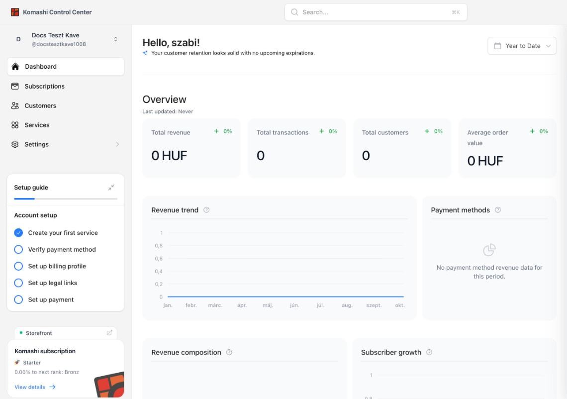
Greeting and period
At the top you see a greeting and a one-line summary, for example Your customer retention looks solid with no upcoming expirations.
The period filter in the top-right corner (for example Year to Date) sets the range for every number and chart on the page.
Overview
Four key figures for the selected period, each with its change against the previous period:
- Total revenue
- Total transactions
- Total customers
- Average order value
Last updated under the heading shows when the figures were last refreshed.
Charts
| Chart | What it shows |
|---|---|
| Revenue trend | Revenue over time, one line per service. |
| Payment methods | How your revenue splits across payment methods. |
| Revenue composition | What your revenue is made up of. |
| Subscriber growth | Active subscribers and New subscribers over time. |
| Churn risk | How many subscriptions are at risk of ending. |
| Transaction volume | The number of transactions over time. |
Hover the ? icon next to a chart title for its definition.
Sidebar cards
Below the main menu, the left sidebar shows:
- Setup guide — your setup steps and progress. See Get started.
- Storefront — a green dot when your storefront is live, and an icon that opens it in a new tab.
- Komashi subscription — your current rank (for example Starter), your progress to the next rank, and View details. Ranks tie into the fees you pay — see Komashi subscription and Provider Fees.
Related: Subscriptions, Customers